
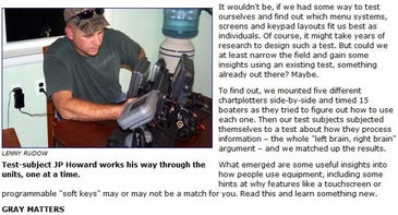
Lenny’s interface testing, flawed?

How does the old expression go…”He who giveth can also be an annoying butt?” Here’s my problem: Last week Lenny Rudow wrote one of the most imaginative electronics pieces I’ve seen since, well, Lenny himself started flushing handhelds, but I think the premise is flawed. Before contemplating my two cents, though, please check out the article yourself, offered gratis by Mad Mariner…
Here’s the thing: What Lenny tested was a user’s first experience trying to perform some standard plotter moves using a particular interface. The problem is that a real user only has to do that once. What a shopper would really like to know, I think, is how easy and quick an interface is once you get familiar with it. And I don’t think Lenny’s testing, as ambitious as it was (hat’s off, truly), really touches on this. The Garmin 640’s middling scores are an an example. When Garmin first refreshed their whole line, and introduced touch screen in the process, I recall that it was extremely easy to accomplish a given task because the interface was extremely linear. But it was also darn tedious, and I joked once that we’d learn to recognize Garmin (non touch) users by their overdeveloped right thumbs!
But when Garmin introduced the 600 series, it was also the first look at much more refined version of the linear interface that eventually spread to the whole line. A lot more controls were put under the context menu key, where you could get to them quicker, for instance. I like the new interface a lot better, and know plenty who agree, but it’s probably a little more confusing for the first time user. Similar thing with soft keys, which scored badly in Lenny’s test. Sorry, that doesn’t indicate to me that softkeys are bad, but rather that the test was flawed. I’ve learned and used lots of plotters and MFDs and I almost always find well done soft keys to be useful reminders, as well short cuts, to what’s possible. In fact, I too like the Lowrance HDS, which ‘won’ the testing, but I would advise buyers to step up to a size with soft keys if at all possible.
All that ends up with Lenny (who’s blogging bigtime now) and I on opposite sides of the fence, but in a constructive sort of way I hope. Unfortunately I have no idea how to do a more relevant user interface test. I also have nothing to say about the left brain/right brain stuff, though I did take the test, and earned a near perfectly split 52/48 score. Does that make me a renaissance man or a dullard? Is Lenny’s test a bit off, or is it me? Soft keys: yay or nay?


I don’t know how objective these tests were, but I’ve long felt that the GUI for these plotters and MFDs are terrible. I have a Ray c80 for over 4 yrs now and still can’t recall how to drill down in the menus and extract commands. Both my left and right brain can’t learn this. I even resort to the manual at times and because the GUI is so dense I rarely use 95% of the capabilities.
Who designs this stuff and what were the criteria? I can say one thing the user interface in the units I have is not intuitive. I’ve tried at times for perhaps 1/2 hr or more to find something or try to display some data on a screen and simply give up.
How did this become so complex and byzantine?
As far as waypoint go I now place one and use the go to cursor. The data is repeated on cockpit displays which is where it’s needed – sog, cog, dtw, ctw, ttg, xte.
In the cockpit I can follow the boat or see its heading on a Garmin PDA iQue which makes a pretty picture and if I want to steer by plotter I use the heading line to find the mark I want to steer to, of course checking that it doesn’t take me into thin water or over submerged ledges.
Data over kill, let’s go sailing.
Stop the presses here, Lenny. Before I even touch on the fact that all boaters were not created equal, I’ll mention that all plotters were not created equal. The single prerequisite in Lenny’s gray matter experiment was all units involved must be priced less than $1500. Are you kidding me? That basically eliminates half the playing field. What about trying to see how people did using a MaxSea or VNS program on laptop? Perhaps due to a familiarity with the Windows XP operating system, the time in which to complete the three tasks would be faster? Maybe because the Raymarine A Series lack a separate ‘Page/Menu’ button that the C and E series include would increase the time to change pages, considering you have the hold the A-Series button for around 5 seconds to get to the menu. Most quality machines on the market simply cost more than $1,500. The Northstar 952X, notorious for its ‘ease of use’ NEVER sold for less than that amount. The point being, you get what you pay for in a chartplotter! Setting a price as the only constant was just the beginning, and then I actually read the article!
The fact that Lenny simply blows off the notion that ‘familiarity’ might contribute to faster operation made my head spin. I guess the day Lenny learned to ride a bicycle he performed to the peak of his ability for the rest of his natural life. Never got any better at it. Go figure. I’m still having trouble finding the correlation between right-brained people and left brained-people, and their ability to operate an electronic marine chartplotter. Nowhere in the article does it mention whether or not any of his test subjects were COMPLETE IDIOTS. When I say idiot, I simply mean ‘people who just aren’t that good with electronics.’ I say that because it’s very possible that Charlie Babbitt might be able to operate a commercial ARPA radar console, and I wouldn’t want to incur the wrath of the idiot savant crowd by generalizing idiocy.
Before this gets out of hand, I am only critiquing what I consider a very brave attempt by Lenny to link the brain to the ability to operate a piece of electronics. This is an experiment that I would never have conducted nor written a piece about, and while it may be flawed at its core it does bring the brain itself into the question of ‘how easy is a particular chartplotter to use.’ Having said that, if someone has any brain at all, they need to sit down and read the operators manual of whatever piece of electronics they buy. If you don’t do that, then the only thing to blame if a machine isn’t easy to use is the brain behind the helm.
I agree the conclusion about soft keys is just wrong, they are highly valuable.
When I read the article last week I was highly impressed at the start, and then was blown away by the conclusions. Realizing that it was chartplotters at the lower end of the market none of those listed I have used, I figured that the results were perhaps skewed by the products in the comparison. Now that I look again, I wonder if a good example would have been if this same test was done before the release of the Garmin 600, and instead was using the Garmin 5xx series chartplotter (no soft keys) I used for a weather product evaluation. Surely the outcome of the value of soft keys would be different !
I can imagine on the high end charplotters the results could also be kind of crazy based on when you did the test. The release of the garmin 5xxx series made the soft key feature of the e-series classic look none to valuable (people in a testing center wouldn’t necessarily pick up the potential issue of using a touch screen in rough seas), then the e-wide hybrid touch would reverse the conclusion as that version makes the soft key feature looks valuable again.
Last spring I auditioned chartplotters, sounders, fishfinders and multifunction displays to outfit a new boat. The previous comment about the abysmal GUI could have been mine. Apple Cumputer has been ruthless in developing a user-friendly, intuitive display and user interface. Nav-x on my iphone is so much easier to use than anything I tried out at West Marine. Of course there is so much more–power, capability, features–in the larger units, but were it not for the small screen I think I would use the iphone for much of the time. It is easy, reliable, works with one finger unless you need two to zoom, and feels like it was designed for the customer not the engineer. I appreciate soft keys and all the cool hardware advances, but
I wish that Lowrance/Furuno/Ray et al would devote serious attention to the interface with the operator, particularly when units must used in less than ideal and stressful conditions–or by occasional users who forget long instruction strings– and an intuitive GUI shines.
I’ve used several chart plotters SIMRAD, GARMIN, and Lowrance and after using Coastal Explorer I will never go back to todays chart plotters. The main reason is the use of a trackball and scroll wheel. I can use the trackball and scroll wheel in almost any sea condition unless I need two hands on the wheel or wheel and throttle. Everyone of the current generation of chart plotters, radars, or sonars could benefit by a different way of navigating around a menu than hitting one or more keys.
Please focus comments on what Lenny and I wrote. This thread is NOT about plotters vs PCs, iphones, etc.
I have always thought I was an idiot savant but sadly my savant scores are low.
Lenny’s testing methods, I think, are of very limited use. If he was testing, say, an auto gps where the consumer may test it in the store yes ok. But for a chart plotter the buyer is going to make a much larger time commitment to learn the interface, the test has to be more involved. Specifiably, once the user has learned how to preform commonly used functions can the procedure be repeated without having to get the manual out. How many keystrokes required? How easy to make errors and how difficult to recover from an error and get back on track.
A more useful test would be to train each user for an appropriate amount of time and then retest.
– good post.
Hey – someone’s actually paying attention!!! A couple of brief points: the $1,500 limit was set, (as stated in the article,) because financial limitation is how people set their own parameters when choosing a unit. If that eliminates some contenders (I was really bummed Furuno wasn’t in there, for example,) it only reflects the reality of choices for most people. Secondly, the people in the study were all experienced boaters who had varying levels of exposure to marine electronics. (No total idiots… unless you include me.) And third, please remember this part of the intro:
“…if we had some way to test ourselves and find out which menu systems and key pad layouts worked the best for us, as individuals. Of course, it might take years of research to design such a test. But using an existing test, could we at least narrow the field?”
The whole idea here was to try out the existing possibilities, see what would happen – NOT to determine which unit is easier then another for someone using it over an extended period of time. I didn’t set out to prove/disprove anything, and the conclusions (including the confusion factor of soft keys)are simply what was discovered when people were pressing buttons on the units. That aspect of it does happen to match my own personal experience, though clearly, many of you experienced users like them. Anyway, I think some pretty nifty info came out of it – thanks all for the interest & comments & thanks for stirring the pot, Ben!
I think there’s a lot of room for different viewpoints on stuff like this — and there should be. These are expensive items that are vital to boaters. There should be some debate.
And so, as the editor who greenlighted Lenny’s story, I respectfully disagree with the characterization that the test was “flawed.” Rather, I think it was, by necessity, limited.
As you mentioned, there’s no way to create a test that covers the entire market and all the users in it, accounting for various levels of experience. So, we limited it to the lower end of the price spectrum, and tested the ability to perform basic functions — something all users confront.
While I’m open to criticism on all Mad Mariner stories, it seems in this case that we are talking about two different points: 1) the ease of use and intuitive quality of a plotter interface as presented by the manufacturer out of the box and 2) the convenience and power of that plotter after it is in use for a while.
Our hope was to address the first point, ease of use out of the box. It is clearly a different game once you have the unit on your dash for awhile (and I’d like to see a test that addresses that). However, how you fare with a plotter over time will depend largely on how well that plotter suits your use and sensibilities to begin with. That is where we tried to focus our efforts.
I disagree that boaters go through the learning process just once on a plotter, or on any system. I think it happens over and over. People learn and forget, then have to re-learn. Your experience during this learning will heavily influence your opinion of the unit and how well it suits you.
Remember that many boaters are not power users. While many of us — myself included — geek out on this stuff, there are many more who simply see these units as a means to an end. Soft keys may be great for an advanced user — and a barrier to others who are not (and who may never be). In a Mad Mariner survey on marine technology earlier this year, 27 percent said they have bought electronics that they could not get to work at all. To these folks, ease of use matters from the very beginning.
I get many comments from readers complaining that the interface on many marine electronics could be easier to use, and I personally agree with that. I also think that the industry is moving in that direction. Our test was simply an attempt to take a measure of things as they stand right now.
Overall, I think people should take the test for what it is: one look at the market, given a specific set of conditions. Hopefully, that look is helpful. But, as I said, there’s always room for debate.
Great start. Now I want to see part II.
Get the same group of testers back into the lab after they’ve had lunch. Mix up the order in which they use the plotters, time them. Then do it again.
Compare the three times on each user for a “more true” ranking of the plotters, because that will tell us:
1) How easy is it to LEARN each plotter. Since a boater is going to be buying and using only one of them on the boat.
2) How FAST is each plotter to do similar tasks. By taking out the “human element,” we can find out how a plotter (it’s UI and it’s hardware) rank in everyday tasks.
Lenny, I would like to see a part II also, it is interesting! Maybe using the best of the best products from each vendor, maybe also seperate first use from having a time limit to develop some proficiency, and if possible just have users test on one product, or one product per week. I think it distorts things once a user learns a touchscreen product then needs to switch to something else. Not reading manuals is fine with me, how many users actually read a manual to use the software they balance their checkbooks with?
I take issue with the soft key conclusion on two levels. First that they can’t be taken seperate from the quality of the overall GUI design. The fixed buttons that are used with the soft keys and the design of what is displayed to the user has far greater weight in the overal design.
Second, soft keys don’t need to be customized by the user to have benefit, a customization which is available in very limited situations anyhow.
Here are some examples of why soft keys I think are great in a product that does not have the more expensive touch screen technology.
1. Having fewer physical keys leaves more space on a product for a larger screen. There is however a point of going to far, some frequently used keys just should never be a softkey, and I find having at least one rotating knob as part of a GUI a big plus rather than having to go click click click click to change a setting valuable visa soft or other keys.
2. Providing the user clear choices for unique situations. For example, when an error displays in the middle of a screen, that soft key that clearly says “clear error” makes a lot of sense.
3. When used well they can cut down your input time. For example when entering a waypoint name, to have the soft keys “clear”, “CAPS”, “SPACE”, “Delete”, cuts down the input time. (remember, no touch screen in these examples)
The more soft keys the better. I really like my car’s dashboard GPS/audio system/telephone for example, it has 10 soft keys (five on each of the left and right sides). They should put this many in charplotters! With every menu on my cars system having less than 10 choices you can quickly get to the functions you want. By placing them on the sides, rather than the bottom, the labels can be longer and more descriptive for those menu’s with tricky options.
Even with touch screen displays, there still exists reasons for softkeys
1. If implimented as virtual soft keys on the touchscreen itself, having the options appear on a consistent spot on the screen makes it easier for your fingers to do the walking, as you know where to expect the option to appear on the screen rather than on a menu that might pop up where you first touch the screen.
2. If implimented as actual soft keys next to the touch screen, you feel your finger is in the right spot before you press the botton and you get that tactile feedback that you pressed something without needing to look closely at the display.
3. I also like that casual users at my helm are not touching the screens and leaving smudges.
Then Aaron when they finish the after lunch session give them two weeks off. At the end of the two week vacation bring them back to find out what they rememeber from the previous sessions.
I guarantee they’ll have forgotten 75% of what they learned earlier in regards to basic unit manipultion and display fucntionalities.
These skills are parishable if not used on a regular basis.
BWP: And the shame is that’s how many boaters use their electronics, so they need to relearn them each spring.
So maybe that validates Lenny’s testing after all: for many users, it’s like getting “new” electronics every year, so an intuitive interface is perhaps better than a powerful one. But I hope electronics manufacturers give us the option, because I certainly love the power of today’s units, and wouldn’t want to lose out on the customizability we have today.
What a collection of “too”s! Too many variables, too few subjects, too much inferance, too few controls, too many biases among the commenters!
There is an entire scientific discipline devoted to designing and conducting this type of study. Unfortunately, there’s no deep pocket out there to underwrite the effort who hasn’t an interest in keeping the results to themselves!
Lenny and Glen, your hearts are in the right place, but the effect of the article is unfortunate. Misinformation becomes urban myth.