Computer-assisted groundings? Bad Navionics charts?
Despite incredible advances in chart availability and chart plotting, keels keep banging on reasonably well charted ledges and reefs all over the planet. Why? I’ve made far too many navigation errors to play the righteous scold, but I am taken aback by the tendency of boaters to blame technology and especially the recent trend toward castigating chart manufacturers like Navionics as if perfect data is a possibility or even an entitlement…
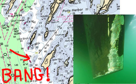
The damaged keel photo above comes from a cruising blog entry titled Navionics Sonar Charts & The Missing Reef, and my apologies in advance to Neil Langford for using his nicely written and illustrated accident analysis as a foil for my arguments about how we should be using electronic charts. In fact, Neil seems like an especially good debate opponent as he and and his partner Ley are deeply experienced sailors — 15 years and much of the globe in their wake — who have also worked hard at sharing information with fellow cruisers. Their site S/V Crystal Blues is enjoyable and valuable reading, and I’m hoping they’ll agree that our difference of opinion about their “computer-assisted grounding” is also educational.
Facts are not the issue. The Navionics errors that Neil reports were 100% true — I’m using the past tense because Navionics has already corrected them, thanks to Neil’s input — which I was able to verify myself using iPad charts that hadn’t been updated yet.
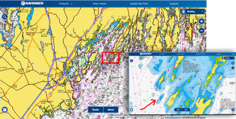
The worst error in my opinion was that the regular Navionics chart (inset lower right above) did not show the 3-foot depth sounding clearly shown on the official NOAA raster chart at top, as well as the NOAA vector chart in the background above, even though Navionics bases its regular charts on the same NOAA data (like all the cartography manufacturers do). But here’s another fact: Every vector chart I’ve ever used, including NOAA’s, sometimes misrepresents significant depth soundings that are prominently marked on the equivalent (paper-like) raster charts (that are largely drawn by human cartographers, not algorithms).
However, Neil’s main complaint concerns Navionics SonarCharts, first how the 3-foot ledge was missing and then how many other errors he subsequently found, at least in comparison to official data. Holy cow, as much as I appreciate SonarCharts, I’ve never even considered using them for primary navigation! As discussed here, I love the ability to share depth information with other boaters, but I also regard SonarChart data with what seems like appropriate skepticism. I expect to see more mistakes on non-official charts like this, and I don’t expect perfection on any chart.
 I was further surprised when Neil reported that fellow Ocean Cruising Club members “were using the SonarCharts when navigating in harbors, as they valued the extra detail provided, and were shocked to hear of our collision.” Dang, the OCC is an experience-based club largely dedicated to sharing accurate up-to-date cruising information — why I was proud to become a member — but “extra detail” is not necessarily extra accurate, or even vaguely correct. Isn’t it obvious that SonarCharts are based on depth data collected from boaters and other non-official sources, and thus best used alongside depth data at least originally vetted by hydrographic offices?
Apparently not, and Neil fairly points out how much Navionics brags about SonarChart detail in its marketing. But then again, SonarCharts are always packaged along with regular Navionics charts, and the Navionics Boating app he was using also offers a third “Government” chart choice in the U.S. (which did show the 3-foot sounding). In the app you can flip from one chart type to another with a finger tap, and on a MFD you can window SonarCharts side by side with what Navionics sometimes calls their Nautical Charts.
Neil also points out that his Raymarine chartplotter prominently marks SonarCharts as “Not for Navigation,” but then goes on to argue, “If I can’t use them for navigation, what will I actually do with these SonarCharts?” Well, sorry, but that’s a sailor oblivious to the fact that a huge segment of chart users are fishermen who are very interested in bathymetry detail for finding spots where fish lurk, a use where data mistakes don’t often lead to surprise keel groundings.
 Perhaps ironically, excellent guidance on the proper use of electronics charts can be found on the Navionics blog. I recommend a thorough reading, but here are some key quotes with my boldfacing:
No single tool replaces the necessary use of sound judgement and proper seamanship. Most boaters employ the good practice of consulting multiple chart sources and regularly updating cartography, while each has its benefits and limitations. Proper understanding of an electronic chart is just as important as vessel maintenance and operation. In fact, reliance on electronic charts should never be done blindly since all charts have errors (official hydrographic office, government, private, or other).
The GPS available on boats is equivalent to the GPS on cars and light aircraft: meant to be used for visual orientation while driving, possibly with the aid of other instruments like sonar and radar, and cross checking every possible source of information. The nautical chart, whether paper or electronic, is not designed and built for instrument navigation, but for orienting visual navigation. The warnings that go with all charts are not there to protect the chart makers, but rather to protect the chart users from making mistakes in over-reliance on any one tool of navigation.
I like to think that many boaters already use “multiple chart sources,” but how about the notion that charts are designed for “orienting visual navigation” instead of just the constant GPS plotting so many of us tend to use exclusively? For me that’s a new way of expressing a concept I’ve long held, and also a prinicipal that fits neatly into the history of charts.
Ledge Chart & Nav History
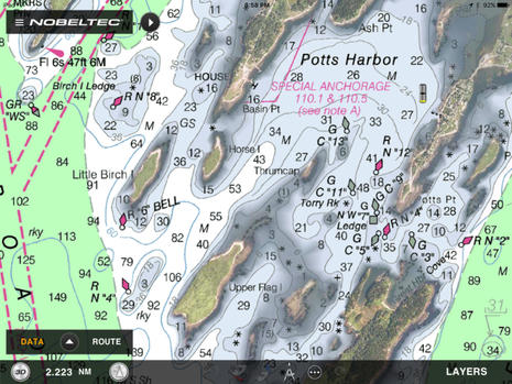
 So let’s take a look at the chart history of the Crystal Blues ledge, which lurks in the southwest passage to Potts Harbor in Casco Bay. Again risking irony, the easiest way I know of to first get a good modern chart sense of the place is via this link to Navionics’ live and free Web chart.
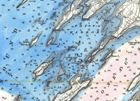 And here, thanks to NOAA’s Historical Chart Collection, is how Pott’s Harbor was charted on paper in 1870 at 1:40,000 scale (direct chart scan link here). The ledge northwest of Upper Flag Island was already known and looks very close in position to modern charts, though the survey seems to have gotten the ledge’s Mean Low Tide depth wrong at 6 feet instead of 3 (Maine ledges thankfully don’t tend to grow).
But I suspect that most 1870 sailors tried to stay well clear of ledges they might not even bump in most conditions, and that was relatively easy to do in this case because the nearby islands provide lots of good visual guidance for staying in deep water. By the way, the soundings on this chart are in Feet for depths up to 18 feet and then in Fathoms, which may have been confusing.
Also, note that the blue coloring was not normal in 1870. Instead, the particular chart scanned for NOAA’s Collection was hand colored for a project about the typical extent of winter ice formation. Unlike the ledges, winter saltwater ice in Maine has changed a lot.
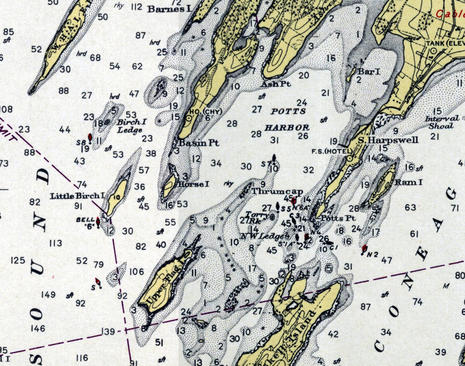 Now here’s a snip from the same 1:40,000 Casco Bay chart as printed in 1943 (direct link here). All soundings are now in feet and the Crystal Blues ledge is not only surveyed as only 3 feet at Mean Low Water but also guarded on its west side by a red and black buoy.
If you check the Navionics web chart viewer or the raster original via NOAA’s online viewer, you’ll see that red makes sense because the buoy is primarily a starboard hand mark for the main channel up Casco Bay. And I presume that the secondary black marking was because the same nav aid could be used as a port hand mark for boats headed up to Pott’s Harbor, though the USCG eventually changed their mind on that idea.
Besides the buoy as a visual aid, note how the cartographers included lots of onshore detail about further visual orientation. And, incidentally, this 1943 chart cost 75 cents, same as it did in 1870, even though NOAA had added helpful red and yellow inks to the print process.
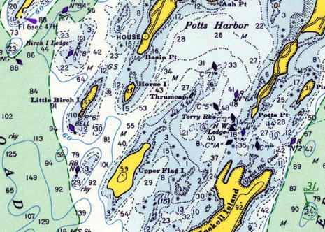 The chart makers had even more colors to work with on this 1971 Casco Bay chart (direct link here), though the price had doubled to $1.50 (an ominous sign of the $27 paper chart price to come). The RB Nun had not been changed to RN “4” yet, but either way a navigator moving southwest out of Pott’s Harbor was responsible for figuring out that the dangerous ledge lay between their boat and the nav aid. Crystal Blues’ navigator Neil Langford admits to inattention in that regard, but let’s add an exclamation point!
Navigation aids are the visual marks — by eye or radar, and sometimes audible, too — that the USCG or similar authorities add to charted natural features as they find necessary for safe navigation. Consider the high cost of establishing and maintaining nav buoys, day beacons and so forth. So isn’t it folly for a navigator not to understand why each aid exists, what it’s trying to warn you about? The answers are often obvious, like marking a channel, but in complex topographies like the coast of Maine it can take some study. And just because a GPS can accurately and constantly plot your position on a chart doesn’t mean that you don’t have to “read” the chart carefully. Isn’t that the grounding’s lesson?
Modern charts
 Now let’s review various charts a boat like Crystal Blues could fairly easily have at hand on a tablet or dedicated marine display these days. In U.S. waters, and many other places — but with Navionics SonarCharts very much excepted — almost all charts are based on the same official data. The fundamental soundings, nav aids, shorelines, shore features, etc. come from the same source, and so the differences involve display nuances, timeliness, and added features. For instance, I’m a big fan of TimeZero’s ability to mix well rendered NOAA raster charts with their PhotoFusion high resolution satellite photos that often improve visual guidance regarding shore features and sometimes even shallow water and mooring detail. Shown is a screen from the TimeZero TZ app (the Nobeltec and MaxSea brand names are slowly going away), but very similar chart imaging, plus a vector choice, is available with TZ PC software and on various Furuno NavNet displays.
However, TimeZero chart data tends to be dated, at least in part because it’s all reprocessed from the original sources so that it zooms, pans and even goes 3D quickly and smoothly. For instance, if you search the TimeZero Chart Catalog for current NOAA raster charts, you’ll see a MWRUSAMAP10.1 Chart List PDF indicating that the last Revision Dates of the current batch are in late 2016 at best. The raster chart dates for other areas like the Caribbean are often even older, sometimes much older (and the 11.1 date list for TZ NOAA vectors doesn’t look good either).
But then again, the TimeZero app with all NOAA raster charts or a big area of Europe costs about $50, the equivalent of about two current NOAA print-on-demand paper charts. And the TZ vector charts sourced from C-Map that can be purchased for other TZ and Furuno charting engines all seem to have been refreshed last summer. Also, to my knowledge, only Navionics claims to be constantly updating the charts they make available for download, and Navionics is about the worst at documenting the sources and dates of the specific data sets behind their charts.
For more detail about data sourcing mysteries, please see my 2016 review of Cuba charts, and also note that no chart maker I know of is yet doing much with NOAA’s valuable Zones of Confidence (ZOC) initiative. The bottom line: Digital charts are relatively inexpensive, but it’s a good idea to have more than one set.
 Here’s the Pott’s Harbor area as seen on a Garmin BlueChart, and I used the inset to show how I had to zoom in deeper before the 3.0 foot sounding that surprised Crystal Blues came on screen. That’s not particularly peculiar to BlueCharts and, as noted earlier, it’s not uncommon in my experience for the algorithms that determine vector chart display to miss an important sounding altogether. On the other hand, Garmin’s bold shallow watercolors are a good visual hint at possible issues.
Note that I took this screen in September (when I started this entry), and now the BlueChart Mobile (BCM) app I used has been sadly discontinued. But then again, if you own a Garmin chart plotter made since 2012, the new ActiveCaptain app I reviewed can put its charts on your tablet or phone at no further cost.
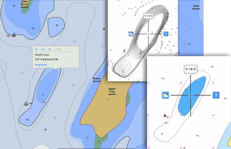
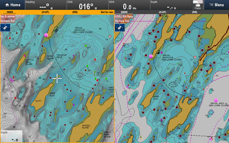 This is how I think Navionics SonarCharts should be used, side by side with the company’s regular navigation charts. So the underwater detail you see on the right is based on (NOAA’s) official hydrographic office data — though vintage and ZOC unknown — while the “extra detail” on left is derived from crowdsourced sonar logs and other sources completely unspecified but definitely not official. These charts are on a Navionics+ card that can be updated at any time during the first year of ownership and thereafter, if you renew your subscription. And the card is being displayed on a Raymarine eS Series MFD, though it will also work with MFDs made by Navico and others (maybe why it seems strange that Garmin now owns Navionics).
 C-Map can offer even more chart types on a single card than Navionics. Their 4D Max+ bundle — seen on a Simrad NNS evo2 above, but also available for Raymarine MFDs — includes a raster chart layer sourced from hydro offices around the world as well as familiar C-Map vector charts, and C-Map “High Resolution Bathy Data” looks a lot like Navionics SonarCharts, though again source unknown plus no crowdsourced data added (yet).
But now that C-Map is a corporate sibling to Navico, the Genesis crowdsourcing technology has become C-Map Genesis, which may well become part of future C-Map cartography bundles. Perhaps also telling about the future of C-Map — which has just become the main chart choice besides Garmin/Navionics — is that they just acquired i-Sea, which has already developed Embark apps that seem to take a very modern approach to route and information sharing. Maybe we’ll see new C-Map apps with the advanced features I recently highlighted in Navionics Boating plus an able alternative to the ActiveCaptain crowdsourcing now also owned by Garmin?
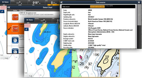 Here’s what C-Map 4D Max+ looks like on the Raymarine eS128 running Lighthouse 2, and it’s interesting to note that the new Lighthouse 3 currently running only on Axiom Series displays also learned to display C-Map recently. With Raymarine now the only major brand that doesn’t own its own chartmaking operation — TimeZero for Furuno uses some base data from other companies, but not their advanced features — one speculation is that C-Map and Garmin/Navionics will compete for their business. So that great screen of chart choices in the background above may be the future. Note, too, the source detail that C-Map has long been good about. And that overall it’s pretty easy to have multiple chart choices on your boat right now.
Chart-assisted law suit?
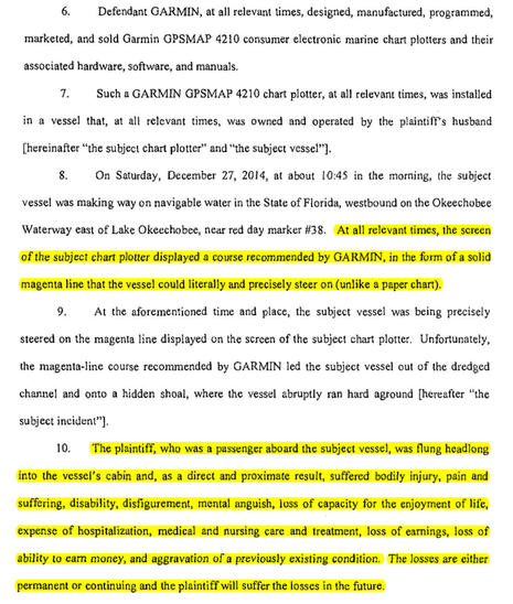
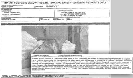 Finally, while I’ve probably spent too much time giving Crystal Blues a hard time about blaming Navionics SonarCharts for not providing a level of perfection that should not be expected, the misuse of charts can have much graver consequences than a damaged keel. The litigation you can read about in Peter Swanson’s Wreck on the Magenta Line illustrates the serious injury possible and also how chartmakers may be financially inhibited from doing things many of us would like them to do, like trying to improve official chart data with other sources, us included.
I don’t think the case has been settled yet, but having looked at some public court records and some relevant chart history, it looks to me like Garmin was helping boaters by putting the magenta line on what seemed like the wrong side of a marker. Navionics did the same thing, and ActiveCaptain had user reports about the shoaling where the channel was supposed to be, all of which was happening in place that NOAA only charts at a fairly useless 1:80,000 scale.
Besides, even if the Magenta Line says so, going fast on the wrong side of a nav aid seems like over reliance on chartplotting to me. Wasn’t it inattention and poor navigation practices that assisted this grounding, not a chart plotter? But the lawyers may be persuasive the other way, and here we are with evidence that even very experienced navigators can apparently be lulled by the precise look of GPS on an electronic chart. Do we have a real problem here, and if so, what’s the remedy?


«Navionics SonarCharts should be used, side by side with the company’s regular navigation charts»
While we like Navionics due to ease of use, to the point it is our “primary”, we always run two other chartsets simultaneously, and at least one must be raster (paper-like). Currently:
* MaxSea TZ – like Ben says, these are official government raster charts at a very reasonable price. If you are in Canada, you get a CHS chart; in France, a SHOM chart, in Italy, an IIM one, etc. Highly recommended.
* Imray Navigator – very clear raster charts with excellent readability. But we probably won’t be buying any other areas because of lack of detail.
I don’t think anyone should rely on only one chartset when in unfamiliar waters, and especially not on a vector-based one (such as Navionics).
Ah, that shallow spot! My old Garmin BlueChart has led us neatly around it to stop at the Dolphin Marina this and past summers.
http://images.sailonset.com/PottsRock.JPG
Last week I came by the location of the law suit grounding, and I can tell you that Garmin (I assume BlueChart) are not the only ones that are wrong. I used C-Map NT on a Furuno MFD, and NOAA charts on an iPad (iNav-X), and they were both wrong. In fact the whole waterway from the Roosevelt bridge to the St Lucie lock is incorrectly charted.
ActiveCaptain and CruisersNet are wrong too, but at least they make no attempt to conceal that they use NOAA charts. Only ARGUS data on CruisersNet shows the correct location of the channel, but ARGUS is now gone, so there are no more updates.
The first rule of navigation is follow the markers and not the charts. Chart plotters are useless in this area.
A few summers back I had a similar accident a bit further up the coast, using b&w cartography on an ancient Raytheon chart plotter. Unexpectedly striking a rock on your keel at 6.5 kts will get your heart racing in a hurry. My lesson learned: nav aids are there to mark a hazard (duh) and since then I have made it a religion to identify where the hazard lies in relationship to where I am and where I’m heading. In MAINE ESPECIALLY there are too many hazards to mark on more than one side. Caveat Navigator!
Hi, here in Sweden we have had our own experiences with Navionic charts. An insurance company tested a bunch of plotters for some reasons, but during the tests they found that in some zoom-in levels the whole blue area over a ground disappeared! Sometimes a whole island disappeared! In one case it led to a speedboat went up on the ground. Navionics had the wrong answer (not our fault, not our problem, zoom in and you will see what you want) but they had to eat it all up and finally re-do all their charts so nothing was lost, at least not island and depth colors when zooming out.
I myself have Garmin and BlueChart and went nearly on ground out in the open sea where it was supposed to be 18 m (55 ft). Suddenly it was only 4 meters (12 ft) so I quickly checked my chart. The small rock was so tiny on the display that Garmin didn’t bother to put out a depth beside it. I had to zoom in to nearly insane level before the true depth of the ground showed up. 1,5 m (5 ft). Puh – I missed it with a few meters.
I discussed it with the man from the insurance company that had made the test mentioned above and showed him my experiences. He was very interested so I went home and went through (nearly) the whole chart after more places where the depth disappeared when I zoomed out. I found a whole bunch so I made a spreadsheet with some 20 places only on my West Coast. But what was most appealing was that a depth figure could disappear when I zoomed out and the show up again when I zoomed out once more! It seemed very inconsistent.
I managed to present my findings for the Manager for Garmin Marine Europe and we had a chat for some hours about this. The problem, he said, was that there was more info on other layers, like prohibited areas due to birds, that – however – did not show up on that zoom level but anyway prohibited the depths to be presented. There was not much to to about it and they got the source material from the Swedish Maritime authorities so if they changed anything, next time they got an update they had to change everything again. Never the less they changed the appearance of their BlueChart till next release anyway so it should be better now. I haven’t had the chance to look into this because I haven’t updated my own chart the year.
With all the respect to the birds, I find it more important to show the depth than to present info on the chart when the birds are laying their eggs.
For awhile I used Vector charts exclusively on Coastal Explorer but last summer started to appreciate the full picture offered in an old fashioned raster chart. I do still have some paper left aboard, just in case there’s a lightening strike.
Ben, thanks for the analysis, appreciate the work. You suggest that Sonar Charts are constructed from a range of unidentified unofficial sources – whereas Navionics clearly state that they start with the Government chart and then add additional data. I certainly didn’t expect them to completely lose so many well known major reefs and ledges as a part of their own production processes.
So I did learn my lesson about trusting just one data source, specially since like most cruisers we have several good ones onboard. My favoured Transas system showed that ledge perfectly well … as did the NOAA charts.It’s kind of painful to watch our course replay within the Transas software, including the rear-guard action with the dinghy towing us backward.
I also take onboard your suggestion about using the Sonar Chart data set side-by-side with the official data. Certainly would have saved me on the day.
Finally, another well-seasoned cruising friend chided me for not doing a thorough route analysis before we departed, using Government sourced data. That would also have saved me plenty of angst….cheers, Neil Langford
Too bad Raymarine chartplotters will not support NOAA charts and Navionics on the same card! If you try to download NOAA charts to a Navionics card, it won’t work because the MFD will not put the ID file on the Navionics card.
This brings up another situation that I have been pontificating about with many other boaters while underway.
With the advent of Navionics dock-to-dock autorouting, are we going to see an increase in collisions because the software is choosing the same, or similar routes for everyone?
I swear that in the last 2 years of using that feature, I have been on collision courses more often than before, and I have been wondering if it is because the skipper of the other boat has used autorouting as well, but for the reverse course, and we are on a computer generated identical track.
It is an interesting thing to consider, and perhaps something Navionics/Garmin needs to consider – adding some randomness into the autorouted courses. Wouldn’t want to see lawsuits over that sort of thing either!
It’s fun to finally see a place we know featured here :). We went thru there both last year and this, including the rather tighter section East of Potts Harbor with no issues – using Navionics in our Raymarine e95. Yes, I/we were paying close attention to the chart, and since I have the NOAA Raster charts in the plotter this year, referring to both charts (tho I didn’t see any discrepancies).
The rock that got us this summer isn’t on ANY of the charts we have (off the Onset channel entrance in the main channel just South of the Cape Cod canal entrance). ActiveCaptain does have a warning for it, but thats the only one I’ve found.
I found a couple years ago that the Navionics SonarCharts are NOT to be trusted in tight spots, especially in areas where folks DON’T cover the areas much – for example, I doubt ANYONE actually cruised over the top of that shoal in a vessel that was recording Navionics soundings – so it never showed up on anyone’s file, and the computer didn’t fill it in from the “normal” chart?!
Al, I’ve never tried to load additional charts onto the Navionics card, but our MFD has two slots, so with a 32GB card, we have quite a few other charts available (NOAA Raster & Vector, some Bluecharts from MX, etc.)
Steve, a similar situation occurs in the Bahamas – in quite a few places, EVERYBODY is using the same guidebook/chartbook-supplied courses, and you see a LOT of other boats (close!).
Hi Ben,
Very well done and I agree with your conclusions. The first order term in the equation is “why traverse a known shoal with no or limited detail when there is plenty of deep water on either side?” On the continuous improvement front, I would like to see Navionics eliminate the “depth box” that pops up when you slew the cursor over a shoal like that implying the depth at the cursor location as it is almost always wrong, no data is better than wrong data.
Larry Hall
F/V Gunsmoke
I have been on a bit of a rant recently against using “crowd-sourced” data for any kind of application with real life safety issues. That comes partly from the time last year when I as close to losing my boat on a reef as I ever have. Definitely a case of “live and learn.”
We are cruising between out islands in the eastern Bahamas. We are trolling and hoping to drag up a wahoo for dinner. To follow the underwater ridges and drop offs, I have my Navionics chart displaying the “SonarCharts” data. We are off soundings in >1000 feet of water.
We hook a fish, and as it came to the boat at first I thought it was a wahoo, but no such luck… just a big barracuda. I think: Odd to catch one of those in water so deep. But while we are clearing the fish, we can see bottom! Our fathometer has found bottom–at 40 feet. while the chart on display is showing us 400 with safe water for some distance all round.
Lets have a look at the “crowd” data which was what I was looking at at the time:
https://fetchinketch.files.wordpress.com/2017/12/shot-60.jpg
Now with the cursor at exactly the same spot, lets have a look at the straight Navionics data:
https://fetchinketch.files.wordpress.com/2017/12/shot-61.jpg
Granted, this is a remote place, and even the “official” data is a bit thin of survey points, but it is RIGHT as to the depth and location of the reef, and the crowd data is dangerously WRONG for the depth and location of the ENTIRE REEF, not just some isolated rock. I know because I was there.
I am sure there will be people who will say, “This could never happen with my C-Map/Garmin/Whoever chart.” But… are you SURE????
It is important to realize that the “official” chart might have its shortcomings, but I could SEE on the display the data available, and just as important, the places where data is sparse. The crowdsourced display might (or might not!) have had data uploaded for this spot. No matter, the algorithm just fills in and makes the rest of it up… Not a huge deal if you are looking for a likely spot to catch fish, but if you are using it to pilot your boat, you can be in a world of hurt.
When cruising in water densely populated by boats (which we try to avoid) the Sonar Data could be accurate and helpful, if only they left the parts blank where they had limited data, or none at all! I had been lulled into trusting the SonarData because I had used it only in such well traveled places.
For what it is worth, our paper charts (which are our primary backup) present data that looks exactly like the Navionics display.
In addition to much of what has been stated I have seen in many cases truncation of depths. Ie. 759’ may appear as 59’ at the next higher zoom level. 83’ may apoear as only 3’. It doesn’t work in the reverse – a shallow depth won’t ever appear deeper. There indeed are many idiosyncrasies in using eCharts. In my 225 page x 600+ image Enhanced Guide to Understanding & Using (Navionics) eCharts I found much to learn. Eg, in 2014 two Norwegian and one British researcher won the Nobel Prize for defining the brain’s GPS. After reading their study and putting its findings in perspective with boating I gained a much healthier perspective on navigation, charting and GPS enabled technologies, selecting crew members and just who can handle the helm in which conditions.
Chuck Cohen, DVM
Marina Del Rey, CA
Neil of Crystal Blues, thanks for being such a good sport!
When Navionics says that SonarCharts begin with official data, I don’t think they mean the soundings. The point of SonarCharts is that the bathy data is from alternate sources.
In fact, SonarCharts used to be called Fishing Charts — actually “Fish’n’Chips” at one point ( https://goo.gl/b6aQvZ ) — and they are a lot like the fishing bathymetry all the other chart makers offer as extra layers. I gather that the underlying data comes from all sorts of places — often the government, since they tend to give it away — but it has not passed the strict requirements of hydro offices like NOAA.
It doesn’t get talked about much but SonarCharts are largely the old fishing charts, not crowd sourced data (billknny, please note). And it’s impossible to tell what’s what, unless you actually submit sonar logs and later see them merged into the massive SonarCharts database, examples here:
https://panbo.com/archives/2014/07/navionics_sonarcharts_now_via_sonarphone_or_gpx_file_plus_the_lowrance_autopilot.html
That doesn’t necessarily mean “SonarCharts bad, NOAA data good.” NOAA requirements seem so strict that data updating is slow and expensive, and worthy projects like Argus ( https://goo.gl/XfFah8 ) fail.
At any rate, what I always recommend is to use many sources, but trust none. I really do believe that great navigators are moderately paranoid 😉
Ben, why not use the Raster Charts by Raymarine, “LightHouse Charts”. Wonder if they would show the missing data, since they are Raster charts derived from NOAA?
To the person who said thay cannot use Noaa charts on the Navionics card…….That would likely be a result of an agreement with Navionics.
Tom, the Lighthouse NOAA Raster charts certainly do show the shoal in question – even Navionics’ primary charts do, but the SonarCharts did not, hence the problem.
Lighthouse charts are encrypted (so you can’t just copy them and give ’em to everyone) and require a “fileID” file to be present on the card they were downloaded onto that tells the MFD how to decrypt the chart for display. Since the MFD will only place this file onto the card if it’s empty, then you can’t store Lighthouse charts (of any kind) on that pre-filled Navionics card and have them readable. In general, you don’t want to, anyway, as there is usually very little spare room on the Navionics cards.
You also can’t move your Navionics charts over to a larger card – they are tied to the physical card they’re installed on, and if you copy the files to another card, they won’t be recognized.
There are ways around some of this, but that’s beyond the scope of this discussion 🙂
In all fairness, what person completely ignores the fact the card warnings and acknowledgement screen TELLING YOU THEY ARE NOT FOR NAVIGATION?
If that’s the case, then I have ZERO sympathy for people that inappropriately used the wrong chart type to navigate with.
Where is the personal responsibility?
Ben,
You wrote:
[QUOTE]It doesn’t get talked about much but SonarCharts are largely the old fishing charts, not crowd sourced data (billknny, please note). And it’s impossible to tell what’s what, unless you actually submit sonar logs and later see them merged into the massive SonarCharts database[/QUOTE]
It really doesn’t matter if the SonarCharts (which are still called Fish’N Chip on my MFD menus, BTW) are all, mostly or only partially, “crowd sourced.” They contain crowd sourced data, and that is reason enough for me to mistrust it.They are not vetted to the degree that NOAA charts are–if the data are vetted at all!
I do not consider them a safe and useful source of navigation data. I have found no places where they have given my information that I trust more than the official charts. You might feel differently, and you are certainly free to do so. I do think they are a great help for fishing.
Soundings aside, I disagree that NOAA charts are not updated quickly. I have several cases where I reported things out of whack on the charts to the local USCG office in charge of such things, and they were very responsive in confirming my report and the changes were quickly brought into the update system… usually within a week of confirmation. Their email address is in the LNTM, if anybody actually knows what that is anymore!
Thanks, Bill, but I wasn’t asking you to trust any source. It just seems unwise to completely dismiss crowd sourcing when it’s just gotten started.
It happens that I’m running a portion of the ICW right now and I’m fairly confidant that the “magenta line” channels and the popular anchorages are very well covered in SonarCharts with actual boater collected soundings data. Heck, it’s my 5th passage thru here collecting sonar logs and I don’t go south every winter.
So while I have no way of knowing for sure, I suspect that I’m looking at good quality crowd sourced data where it counts. Which is to say that a lot has been collected, some of it quite recently, and Navionics algorithms have been smart about throwing away the anomalies and favoring the newer info.
On the other hand, I presume that almost all the SonarCharts data outside the ICW was originally fishing baythy and probably came from one source, who knows when or how. My wild guess: crowd sourcing is 5% of SonarCharts at most, maybe more like 1%.
As to NOAA data, please see what NOAA itself has to say about how current much of their soundings data is:
https://panbo.com/archives/2016/07/noaa_introduces_zones_of_confidence_mind_your_zoc.html
I’m very appreciative of all the work NOAA does for us, and thankful that the cost gets spread among all taxpayers, but I did once document a case where it took many years to chart a large breakwater that was built and precisely surveyed by another branch of the government:
https://panbo.com/archives/2010/10/why_we_need_crowd_sourcing_downeast_2.html
Why sail over that shallow area when there is deeper water a few feet away? If you choose to sail over a knob on the sea floor when there is clear sailing right next to it then you get what you have coming. The main problem here is poor seamanship. Any type of chart is not to blame when the skipper makes poor choices.
Geez, red “4l , an actual physical,ATON is um, right there on top of it. Just sayin’
Hi Ben,
And now a comment from the Pacific Northwest! In 2016, several boats from the Seattle area were cruising north in the Seymour Channel west of the Glass Peninsula in Admiralty Island in Southeast Alaska. As we approached Buck Island (57N-44’W, 134N-06’W), fortunately in CAVU conditions, two boats inquired why the island to port was neither shown nor labeled on their Navionics software (NOT SonarCharts) displays. The only thing showing were the two awash rocks located north and south of the island, but not the island itself. A third boat (mine) was last in line, and reported that both the native NOAA raster and vector charts for the area BOTH clearly displayed the Island, it’s name, and the rocks.
Inquiring minds want to know how Navionics can lose a 20-acre island, with a height above low water of something like 50 feet? I get it when bathymetry can appear and disappear on vector displays, depending on zoom, and whose data you might be accessing at the time. But I just can’t figure out how Navionics can lose an entire island when zoomed into a practical scale for surface navigation. And more egregiously, when the applicable data is clearly shown on the NOAA cartography for the area. That seems sorta basic.
Roger, roger for using multiple navigational aides at all times (like, your eyeballs in this case). And this is clearly a higher-level topic than using crowdsourced bathymetry for this area. There just isn’t any!
Regards,
Pete
Neil Langford said: “Finally, another well-seasoned cruising friend chided me for not doing a thorough route analysis before we departed, using Government sourced data. That would also have saved me plenty of angst….cheers.”
Perhaps the most important point in all the posts. As a sometime cruiser and captain of several Coast Guard Cutters it was always our practice to review our charts and planned track with the “drivers” before leaving the dock. That was before all our fancy electronics but I still think it good practice to review where you are going and how you propose to get there before flipping the switch and leaping off into the dark.
Peter, if it helps any, we anchored behind a clearly charted island – Grog Island, off Rones Bay on Dymer Creek in Chesapeake Bay (37D 40′ 13″N,076D 19′ 47″W) this fall – the only problem was, the island is GONE!
All the extant (Navionics, NOAA, etc – I checked Active Captain today – still there!) charts show it, but locals told us it disappeared a few years ago, part of the ongoing (all natural) process of turning Chesapeake Bay into a swamp 🙂 Fortunately, the situation is not dangerous – the anchorage is still there, but is no longer protected by an island, just a shallow sandbar.
Point is, cartographers make mistakes – sometimes its because the update cycle isn’t fast enough, sometimes they just blow it – a prudent mariner has more than one source of information -and still treads lightly!
I’m sure Navionics would correct their error if you tell them, just as they & NOAA will soon remove Grog Island.
Thanks, Peter (and Hartley). In fact, Navionics has sort of corrected the error you describe. Buck Island is now clearly charted, although the bar between the island and mainland that NOAA charts as uncovering at low tide looks about 10 feet deep on Navionics regular and SonarCharts.
That’s a very interesting area cartography wise. I imagine you know this already, but it’s not at all obvious in Navionics or even NOAA vector charts that the best chart scale is over 1:200,000. That’s a very crude chart scale, especially given that the similarly rocky coast I cruise has been charted at 1:40,000 or better.
There are some 1:40,000 charts in that area, like Gambier Bay, but at least half of Stephens Passage is greater than 1:200,000. I hadn’t realized that any of the U.S. coast was charted so crudely.
Not that NOAA is hiding anything:
http://www.charts.noaa.gov/InteractiveCatalog/nrnc.shtml
Berne, I thoroughly agree about the value making and checking routes. There are several PC charting programs like Coastal Explorer and TimeZero 3 that are very good at this, but unfortunately the otherwise very capable multifunction displays are generally awkward at routing. Screens aren’t big or fast enough, touch and/or cursor button interfaces not precise enough.
Improving MFD autorouting looks like it will help with this problem eventually (though the wise navigator will always check it over), but in the meantime many of us are using tablet apps that can then sync routes to the boat’s primary nav screens, like the Navionics Boating I recently wrote about:
https://panbo.com/archives/2017/10/navionics_garmin_part_1_long_live_plotter_sync.html
Berne wrote”…That was before all our fancy electronics but I still think it good practice to review where you are going and how you propose to get there before flipping the switch and leaping off into the dark.”
I agree 100% and this is the reason that I am a big proponent of always planning routes on a laptop using both, raster and vector charts. Once one is comfortable with the routes, they can be uploaded to a chart plotter.
Looks like the LightHouse 3 software is out for the Es and Gs displays!
http://www.raymarine.com/software-updates/mfds/lh3/es-gs-series/
Thanks, Tom, but I suspect that page is still under construction and wasn’t meant to be found yet.
There are hints like “Software Version: v3.3.xx” (not the final number) and “Release Date: Jan 2018.” Also the “3.3” files you can download for Axiom and Es/Gs are the exact same, which isn’t right, and I’m pretty sure it’s really just the 3.2 Axiom update file used as a placeholder as someone builds the 3.3 download pages.
I say be very careful, and look for an announcement about 3.3 on the main LightHouse 3 page, probably not until January:
http://www.raymarine.com/view/?id=15032387737
On the other hand, the page you found does contain the most detail I’ve seen yet on the differences between Lighthouse 2 and 3, at least at the version 3.3 stage we are about to experience. Hopefully people will read it before making the move from 2 to 3, so there are no surprises.
Interesting! Tom Hale reports that Navionics “Sonar Charts’ accuracy has improved to the point that we used the sonar charts for the entire ICW this fall. We never touched bottom or ran aground this fall; we do touch occasionally most years.”
Tom has been doing great coverage of the ICW on the “SAIL Magazine Secrets of the ICW” Facebook page and I consider him a highly trusted resource:
https://www.facebook.com/SailMagICWRally/posts/958124004341814
But I’ll add that the ICW probably has fresher and more redundant SonarCharts crowdsourced depth data than most any place on earth. So while they may work fine for primary navigation in the ditch, that does mean they will work well other places, even right outside the ICW.
Happy New Year, Ben and everyone!!
Looking at the differences, I think I’ll stick with LH2, even if they produce LH3 for my e95. The loss of the tide charts alone does it for me.
WRT Sonarcharts, maybe Navionics needs to shade them with some sort of indication of how many tracks contributed to that bit of water – places with 0 or 1 might not get the same respect as a spot with 6 or 8 🙂
Kinda like those charts NOAA put out a few years ago showing the level of sounding coverage in different areas.
A year plus later, a further comment on chart issues. We just got back from 2 months in the Bahamas – The Berrys, Eleuthera and Exumas. We had three different charts on board – Navionics (updated 3/19) and NV on the chartplotter, plus Explorer on my phone and iPad (plus a paper version of Explorer).
The Explorer wins – and everyone I talked to agreed that Explorer is the BOSS for the Bahamas. NV got us hard aground ONCE – after that, I used Explorer in every tight spot, and we found several more places where both NV and Navionics would have led us astray.
As far as Sonar Charts, because pretty much everyone follows the same course lines, the sonar charts are simply bizarre. (Tho the Navionics sonar chart of the area we ran aground in would have worked)
Having been in the aviation world, the level of charting inaccuracy found in marine charts is a real eye-opener!
Back in the US of A, I’ve had zero problems with Navionics – but the Bahamas is not nearly as well covered.