Raymarine AIS intercept graphics, better collision avoidance?
 Given the recent strong interest in MARPA collision avoidance, let’s look at Raymarine’s new AIS target interception graphic overlays. I’ve only had a little on-the-water experience with this and other collision avoidance features that came in the LightHouse Release 15 update last October, but I sense that a lot of boaters will appreciate the intercept zone concept, plus it may encourage other brands to follow suit or work on other ways that our very talented multifunction displays (and PC charting programs) can help us avoid unpleasant surprises. First, though, I have one substantial gripe…
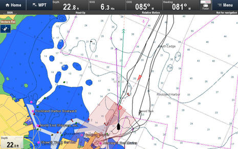
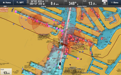 I grabbed this screen during a Raymarine demo ride in Fort Lauderdale and I believe that it illustrates in strong graphic terms why the optional intercept zone feature should be able to filter out stopped targets instead of, or in addition to, making the zones circular for vessels under 2 knots. If the circles above were eliminated, you’d see the one moving vessel that’s within the chosen intercept distance (which may be set a little long). Actually, I think that a near-zero-speed AIS target filter is a valuable option for any AIS display, or at least the ability to reduce such vessels to dots or tiny icons so that more active targets show up better. (It can’t simply be zero speed because a GPS will often show occasional SOG on a boat that’s tied up.)
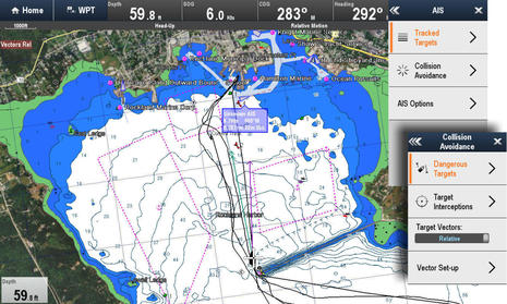
But the screen above does indicate that target vessel size is one of the variables that Raymarine uses when determining the size of an intercept zone — which I like a lot — and you can also see a couple of the useful new target icons they’ve introduced…
![]() It strikes me as good whenever a regular screen can deliver more information a skipper may value without button clicks, as long as it doesn’t further confuse things, and I think we’re looking at a nice example here. Some of those icons should be showing on any AIS display — like AIS SARTs and AToNs (though Garmin may still be behind on AToNs) — but I don’t recall an MFD screen tipping me off to High Speed craft or (sailing) Yachts before. Note that with LightHouse 15, Raymarine now also offers a choice of Relative or True Motion vectors for AIS targets.
It strikes me as good whenever a regular screen can deliver more information a skipper may value without button clicks, as long as it doesn’t further confuse things, and I think we’re looking at a nice example here. Some of those icons should be showing on any AIS display — like AIS SARTs and AToNs (though Garmin may still be behind on AToNs) — but I don’t recall an MFD screen tipping me off to High Speed craft or (sailing) Yachts before. Note that with LightHouse 15, Raymarine now also offers a choice of Relative or True Motion vectors for AIS targets.
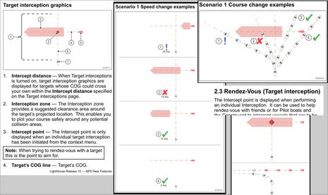 Before going on to my one brief experience with Ray’s AIS intercepts on Gizmo, please click bigger the manual snippet collage above (or, better yet, download the LightHouse 15 New Features PDF). This is a different way of doing things, and it takes some getting used to. An interception zone may be something like drawing a Closest Point of Approach (CPA) but a “suggested clearance area around a target’s projected location” is a larger, vaguer space, though it may make more sense in the real world. Notice how the interception zones dynamically change with your speed (or the target’s) and also how course changes that put you behind the zone, like #3 and #4, mean you will pass behind the target (though that’s not completely obvious in the diagram).
Also note that Rendez-Vous is an additional intercept function individually applied to targets. The name comes from its usefulness for coming alongside a vessel, as I once experienced on the Penobscot Pilot, but in fact that means marking a CPA of zero distance, and some boaters will no doubt use it for that critical bit of information.
 So, here I was motoring into Rockland Harbor on October 15th with Lighthouse 15 freshly loaded into Gizmo’s test Raymarine system. I’d activated target info on the one moving AIS target I’d spotted and was digging into the new AIS Collision Avoidance menu to try the Target Interceptions…
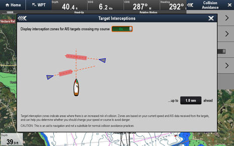 Wow, it’s nice to have a menu item expand to nearly full screen with text and illustrations explaining the function, as well as an on/off toggle switch and fields to set the function’s parameters – all in one. (There are other screens like this new in LH15, and they reminded me of what one commenter would like to see added to the Raymarine sailing features I tried. I’d like to see them everywhere.)
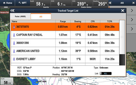 I also had a look at that active target on Ray’s new Tracked Target List, which separates AIS from MARPA, employs the new AIS icons, and also shows bearings as Port or Starboard of the bow, which I may well prefer once I’m used to it. Note that the target, which I could see as an island ferry like the Everett Libby, had a CPA of 0.8nm and a Time of CPA of 01m 29s away. These values did not cause an alarm, which was fine with me…
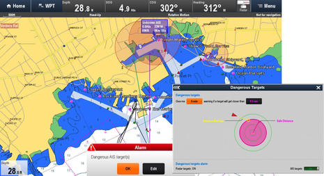 But — doh! — not much later I did get alarmed, even though the ferry had backed into its pen by then and thus joined all the other stopped AIS targets. Now AIS intercept zones and AIS/MARPA danger alarms are separate functions, but again a near-zero-speed filter would be appreciated. In fact, Ray has also tweaked its Dangerous Targets function, as explained in the screen I inset above (not to scale). Again, I appreciate a visual explanation of what a combined CPA/TCPA alarm looks like, but I see plenty of room for a line reading, “Ignore targets traveling less than ___ knots.”
I have expressed my filter desire to Raymarine product development people and I gathered that while collision avoidance is considered a work in progress, it also involves consultation with the liability department. Maybe that’s why MARPA target alarms can’t be turned off like AIS targets can? And, by the way, I don’t know if Raymarine is considering intercept zone graphics for MARPA targets, but they seem at least theoretically possible.
And I did lurk around Rockland long enough to get some more realistic experience with intercept vectors, as seen with two moving targets below. I need a lot more use time to know for sure — which won’t likely happen until spring (sigh) — but AIS interception zones seem to offer a useful animated aid to understanding where collision danger exists and how that spot moves around as you and/or the target vessel change speed and/or heading. Perhaps a reader has already had more experience with Raymarine’s new feature, or maybe you simply have an opinion one way or another?


Hmm,
Blocking rhe map.
Could be nice in absolute fog or a blinded wheelhouse.
Interesting comment, Hendrik. In my brief experience the intercept zones hardly seemed to obscure the underlying charts at all. On the other hand, I was annoyed with the large point-of-interest titles you can see on the C-Map 4D charts of Rockland. They really can obscure more important chart data and you can’t turn them off. But it is a known problem at C-Map and these new charts for Raymarine MFDs are otherwise quite good, entry coming.
In many areas, adoption of AIS is pretty much limited to mandated users. On the Hudson, for example, between NYC and Port of Albany,about the only users are tug/barge combos, and large day-cruise boats. It can give a false sense of security, when even large, fast yachts generally lack it, and they don’t move at a snail’s pace like the barges do.
Until there is better penetration geographically, ARPA/MARPA is far more useful than AIS in many areas. I’m assuming as AIS prices drop dramatically, they will eventually be mandated for more and more classes of vessels, much like transponders in aircraft.
In the past few years, I’ve witnessed a declining use of even VHF, relying exclusively on cellphones for near-shore boating, a big mistake, especially when other boats can get to you far quicker than USCG can, plus phones lack DSC and most have less precise position-reporting. Sorry for straying off-topic, but felt it needed saying.
Fair enough, Karl, but I think you’d be noticing lots more recreational AIS out along the coast, and the U.S. commercial mandates expand quite a lot effective next March 1:
https://panbo.com/archives/2015/02/more_ais_in_the_usa_the_new_uscg_requirements.html
What might really change the cost of Class B AIS, which has gone down anyway, is the advent of a combo VHF and AIS transponder, and by golly I think that may actually happen sometime next year.
But there will still be plenty of vessels without AIS moving around well into the future, especially as you get into more protected waters.
Do we really need 18 different icons to display an AIS target? Often I use the chartplotter to look at the chart — surprise, surprise — having all these different possible AIS symbols just makes reading the actual chart that much harder. It isn’t like you will remember what all 18 of these icons actually mean , as you probably haven’t seen the more obscure ones for many months, if at all. This would be fine if it was an AIS Plotter, but it is an MFD that is primarily a Chartplotter.
Paul
Paul,
I welcome the option. Its another piece of the puzzle.
I cant really understand what your complaining about. You can always ignore the icons and pretend they are the same. But that seems silly.
Tom
Try going into an area that has maybe 50 or 75 AIS targets in front of and around the channel — say the Pacific entrance to the Panama Canal — while you want to use the chart as a chart. All that additional clutter gets in the way. I am all for displaying AIS targets, my gripe is trying to convey too much info by changing the icon for each type of AIS target, thus offering more opportunities for the navigator to be distracted or confused and possibly miss something else far more important on the chart. We are not talking 1 or 2 different icons, but 18. As I said it is primarily a chart plotter, not an AIS plotter.
Paul
Thanks, Paul, but I’m surprised that you’re critical of Raymarine’s AIS icons while not mentioning the stopped-target filtering I advocated in the entry. You can see how this works at the Panama Canal entrance on Marine Traffic:
http://www.marinetraffic.com/en/ais/home/centerx:-80/centery:9/zoom:10
Use the filter command to uncheck Anchored/Moored vessels and about 2/3rds of the AIS targets go away. Wouldn’t that be a much more effective way to unclutter your screen?
Several manufacturers like Simrad already let users filter out AIS targets going “less than ___” speed, so I think it’s quite possible that Raymarine could add this option if enough customers thought it valuable (and the liability dept. agrees ;-).
Alternatively I believe it’s possible right now to run a Raymarine MFD with two chart windows open, one with AIS overlay and one without.
Incidentally, if you applied Ray’s icons to what you see on MT, I think that you’d only see the same three common ones visible on my screens above — Unknown Vessel Type, Yacht, and Commercial Vessel. Also, just about every AIS plotter I’ve seen show Vessel, AToN, Virtual AToN, SART, Lost and Dangerous targets as different icons, and I doubt that causes much confusion.
I agree, it would make a big difference if Raymarine would filter out AIS targets below a selected speed.
In regards to icons which I generally like a lot, I noticed some icons have a white or blue background to them (for example some of the green marks) that obscure or cover more pixels around the edges than they need too.
Ben,
Not sure that saying that you will normally only see 3 types of icons in anyway justifies having 18 different icons. Icons only transmit valuable, non-distracting, information when you are familiar with the icon. Having a few icons is a good thing. Having many icons is just bad UI design. I wonder if a design like this would be accepted for military flight control. At least in that case the pilots would be trained on recognizing by sight all icons instantly and each type of icon would probably demand a different reaction.
In the example target interceptions menu item expand picture I’d sure like to see CPA and TCPA for the targets clearly displayed at the same time. The current image doesn’t really give you the time before the possible events occur — ie the time to go get the captain or start some type of avoidance.
Paul
Geez, Paul, now you’re imagining things to worry about. Nothing about Raymarine’s CPA/TCPA display functions changed in LightHouse 15. You can still see a list of targets with CPA/TCPA or have individual targets display the values. Intercept Zones are simply an optional way to show similar info that some of us might like.
Also please stop with the “18 different icons.” 2 in your count just explain how relative and true vectors are shown, and 6 are just status indicators applied to regular icons, most of which are already in common use.
Of the 10 regular target type icons, Raymarine added 5 that are not commonly used, 3 of which you will very rarely see out on the water. So really what you’re worried about is getting confused by 2 to 5 new icons (that don’t obscure the underlying chart any more than regular icons).
Also please note the new entry where a cruiser who’s put around 1,000 ocean miles on Raymarine’s new AIS icons writes, “I REALLY LIKE the new symbol set, especially the one that clearly depicts BIG power boats vs little ones.”
https://panbo.com/archives/2015/12/tbf_simradbg_compact_remotes_ocean_signal_ais_mob_alarm_digital_yacht_pc_radar_pc_more.html
I am a little lost, what are Raymarine’s definitions of Yacht/Commercial/High Speed craft?
Is this based on Class A vs Class B? Or on the IMO definitions that Class A transmits?
Ben
You missed my point on the CPA/TCPA. I was referring to the User Interface design. When the display is shown with the new Intercept Zones, I would prefer to see the CPA and TCPA of the target in question displayed in the same panel and not have to poke around to other menus to see it (and possibly then go back to this one). In practice I will be using the CPA/TCPA information at that time to make decisions. (or am imagining that 🙂 )
There is a wide range of users of these MFD UIs. I feel they need to work on small screens (mine’s a Furuno 8in, not Ray), in tough environments not just on a large flat panel in the comfort of a stable wheel house. When the operator is cold, wet and fatigued, hanging on half sideways to the boat with salt smeared glasses, poking at the MFD to get what they feel is vital information — a clear, easily readable and usable UI is important. It isn’t all just about adding features.
Paul
Anon, I don’t see anywhere that Raymarine is specific about how they apply the new AIS icons (which would be nice) but it sure looks like they use the vessel type field that’s part of Class A and B static data messages (the lists are similar). High-Speed Craft, for instance, is a type (though I don’t know how high the speed cut off is). So is Sailing (Yacht) that Ray represents with the curved “sail” icon. Commercial is probably defined as vessels which self identify as Passenger, Cargo, or Tanker but maybe vessel length is also taken into account. It looks to me like Raymarine is trying to strike a balance between icons for every type — too many, for sure — and a few distinct ones that might help us sort the targets with what we actually see and/or care especially about. Also note that boaters can compare the icons to AIS target details to get a better sense of Ray’s definitions.
Now I’m confused, Paul. Are you criticizing how Raymarine has shown CPA/TCPA for a long time, because I don’t believe it’s changed at all and wasn’t the subject of this entry? And, yes, I’m pretty sure that you can display individual target CPA/TCPA data and Intercept Zones on one panel (window).
I thoroughly agree that interfaces are very important, especially on smaller screens. But these Interface Zones may be an easier way to get sufficient collision avoidance information, especially on a small screen. Once enabled they give an automatic and dynamic sense of where the danger areas are, as opposed to having go to the main menu for the target list or tap/cursor the target context menu for the individual CPA/TCPA. Yes, you can use that same context menu to have a target’s info overlaid on the chart, but some may find that more distracting and chart obscuring than the zones. Only experience will tell for sure, and users who don’t like the Zones never have to use them. Ray’s CPA/TCPA interface remains the same, and fairly similar to other displays.
To learn more about the CPA/TCPA interface check out the “a-c-e Series Installation and operation instructions 81337-13-EN” PDF you can download (the New Features manual I linked to above only explains the new collision avoidance stuff). And, incidentally, the regular manual shows that Ray has added even fewer new AIS target icons than I thought.
Personally, though, I try to avoid making judgements about interfaces even after a good look at the manual. It seems like they have to be tried underway. Have you tried the Raymarine interface, Paul?
Ben
I read and enjoy Panbo to see new things, so of course I haven’t used the intercept display feature.
The Intercept feature display window that you highlighted is there, the best as I understand from your description, to warn in a graphical sense of a possible collision situation. When the Intercept feature is displayed what is the next step that the user is likely to do? Figure out how to avoid the collision. If it were me, I’d like to see in the same place the CPA/TCPA on UI so I could make a good decision as to avoidance approaches without having to go to other menus.
Truce
Paul
I spent a lot of time the last three weekends playing with the new AIS features in R15. In Seattle near Elliott Bay and Puget Sound, where I sail the most, AIS is invaluable with all of the ferries, containerships, and tug traffic coming and going.
I like the new boxes to show collision zones, but I agree with Paul that it would be nice to have some of the time values shown right inside the boxes so that I don’t have to click somewhere else to see them.
I also would love to be able to hide some of the unmoving AIS targets. For sure I’d like to be able to mute the alarms for all of the stationary targets in my marina and nearby that go off when I arrive/depart – no one seems to have ever figured that out.
I prefer the new iconography they’ve chosen for the different types of vessels. Not only is it a quick visual reference to what sort of vessel it is, but it also helps in picking which vessel is whom in a crowded bay.
I’m still not 100% convinced of some of the other UI choices though – having to click on each AIS target I want to actively track and flip a button, or doing that in a grid view is not terribly efficient. It would be better to be able to click and tag a bunch on the map itself, but that’s a small complaint.
I’ve used B&G/Simrad and Garmin within the last year, and I think Ray’s approach to using the data they all have, and presenting it in a fashion that makes more sense to me, is better than everyone else…. for now 🙂
I wrote up some of the experience on my blog at https://www.sailbits.com/blog/2016/05/port-orchard-weekend/