MFD comparisons #3, chart plotting in 3D part 1
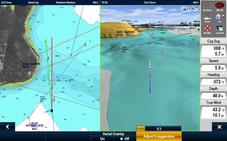
If I can miss major ways that MFDs display currents and tides, lord only knows how much I might mess up a comparison of 3D charting. There are so many aspects to 3D presentation, and virtually no bench mark as to what is right. In fact, I’m running the Raymarine E140 Wide screen shot first because it illustrates one of the few things that’s clearly wrong, I think, which is to put the vessel on center, so that you get the most detail of the waters you’ve already passed through. But Raymarine has long offered good Look Ahead features in its 2D chart presentation (as seen in the left window, set at 2/3rds ahead), and I know that 3D Look Ahead is high on its list of planned software updates…
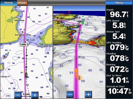
I suspect that the TMI (too much information) on the horizon, and the lack of spot soundings, may also be on Ray’s list, but the latter is one of many 3D aspects that are subjective. I watched a friend nearly swoon when he saw Garmin’s Mariner 3D with hazardous depths marked in reds and oranges, and that was before Garmin added the spot soundings option seen below. I like seeing those numbers myself, but understand that they’re not really necessary and may be viewed as noise by other navigators. I wish Garmin would make zooming in and out of its various 3D views possible, not just tilting, but also understand that it’s made many friends by keeping things simple…
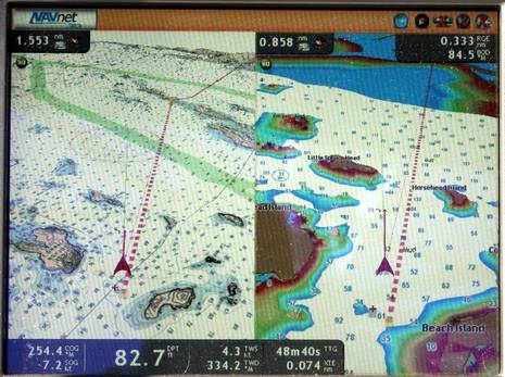
The 3D view on the Simrad NSE — only available when using a Navionics Platinum card — can be zoomed and tilted, and I’m getting fond of it. But I’m also aware that some boaters don’t care for 3D at all. Where do you stand? And if you do use it, what do you like about your MFD’s presentation and how can it be improved?…

And of course let’s not forget NavNet 3D. Furuno has gone further than anyone with 3D, and it’s my current favorite in this regard. I even like upside down raster charts in 3D. I’m going to spend more time comparing 2D and 3D charting across the MFDs, but I’m also writing magazine articles on the subject right now, and would appreciate any and all feedback.


Ben ……
Great topic …..
I’m posting two videos that cover most of the 3D functionality of the Garmin 740. This functionality is the same found in the 6000/7000 series and is much different than the 4000/5000 series.
I prefer the 3D displays ….. they add a lot to SA.
In the Marines Eye View using the 700/6000/7000 series there are two distinct chart choices Classic/Chart. You’ll see both. I like the integration of XM Weather/sonar in the 3D displays.
I’ve installed a couple of the new Simrad units and I must say they are cutting edge. The functionality is very well integrated and flows easily once you understand the matrix.
As with any of these units the more you use them the more familiar you become with all the functions and capabilities. Users have to be aware use leads to unit proficiency. I always tell my clients you’ll lose proficency if you don’t use your toys on a regular basis ….. they are perishable skills for sure.
Here are the videos … 1st inshore 2nd offshore.
Great discussion.
Inshore
Offshore
Tom
Quite the selection you’ve managed to drum up for us, Ben 🙂 Keep it coming!
I know the 3D looks really neat in the store, and is great for impressing friends. I’m not yet convinced that it improves situational awareness.
Here’s where I’d like to see more engineering effort focused, and the features I’d be judging any potential MFD purchase on when it comes time to outfit my next boat:
A simple display we can read at a glance. No superfluous visual elements, no decoration- just the important chart elements, AIS/radar targets, etc.
Use that computing power to distill the information into just the important bits. The computer shouldn’t be spending its time calculating pixel shader values- it should be calculating the possible actions I might take and those of nearby targets, and presenting the relevant chart, radar and AIS data as it becomes necessary.
Give me real time, seamless pan, zoom and chart quilting for whatever chart formats I choose to use. I don’t want jerkiness or noticeable redraw time when changing views, and I don’t want vendor-locked charts.
Take the money that is spent on animated menus and flashy but rarely used features, and use it to give me a solid, truly waterproof case that doesn’t feel like it’s going to crack open if I bump it wrong.
Perhaps the biggest concern I have about these devices is that, if they get too fancy, they distract the helmsman. I’ve been nearly run down on several occasions, observing (as the offending boat passes me) that the helmsman is fiddling with his MFD instead of watching the surroundings. Electronics are not a substitute for real situational awareness. A computer is just a tool- in this case, a tool to bring up the right charts, AIS and radar targets at the right time so that I can concentrate on watching what’s around me. If the computer regularly becomes the focus of attention for more than a few seconds, it is such a liability that I would rather do without it and pull out a paper chart.
Oh well, first about look ahead – when you’re in a place with lots of traffic, it’s useful to see what’s behind you (with radar overlay turned on) – we think you stand at least an equal chance of bad things from the aft as forward.
As for 3D, we think it’s a marketing gimmick – can’t think of a single advantage relative to directly overhead view (where you really sort of know where you are). With 3D, what is your perspective? 10 feet off the water? 100 feet? How exaggerated is the “altitude” dimension? We’ve never seen that specified.
You didn’t bring up photo overlay, but that must be coming, so we’ll blast that marketing gimmick too! Yeah, it’s cool to show photos ’cause we all know that they are really correct. Well, not really, especially when the photo is warped to the chart (hey, isn’t the chart the authoritative source? I bet your insurance guy thinks so.) Anyway, without adequate ground truth you really don’t know much about a photo by just looking at it. At a boat show recently, the sales guy had a photo of some place in the Bahamas and the water had different shades of blue. “You can see right where the channel is”. Not on our boat, OK, rant over.
Sherri & Nick
Not sure but whether 3D is really useful for the actual navigation?
Great, just the sort of debate I was hoping for. A few of my cents:
* Matt, I completely agree that the ultimate goal is an MFD plotting display that can deliver the essential information as clearly and quickly as possible, so you can get your eyes and attention back up and out where it really should be. But I don’t think there’s a well defined way to do that. Spot soundings versus shaded and/or colored bathy lines is a good example. Are soundings essential to safe navigation or an artifact of the age when when 3D bathy couldn’t be printed well? Garmin offers both styles with their “Classic” and “Chart” Mariner 3D modes, which I think you can check out thanks to Tom’s videos.
* Nick, I really don’t think 3D is just hype. If it was, how come it’s become the default mode for vehicle navigation? And gaining in aviation? Are those forms of navigation really so different, or are many boaters so used to top-down, 2D charting that they think it’s the only way? But aren’t we used to that mode because it was really the only way to print charts efficiently? Have you ever seen old Admiralty charts with landfall silhouettes drawn in margins? It must have taken a lot of work to create those early attempts at 3D, but those sketches were very useful back in the “golden” age of non-electronic navigation…when you weren’t very sure where you were much of the time 😉
And, yes, I will compare photo mapping. I think it can have real value if the resolution, integration with chart data, and redraw speed are right. Especially in places like the Bahamas. I recall that Nigel Calder — who’s been properly skeptical about electronic charts over the years — had a sort of epiphany when using Nobeltec Bahamas photo maps overlaid over charts.
* Anthony, if 3D really is useful, it’s for actual navigation, I think. I much prefer doing planning in 2D, North up mode. The advantage of 3D, when done well, is that it simulates/improves your actual point of view. Furuno and Garmin even seem to use fast heading and maybe roll info to make the your 3D boat icon move on screen like your actual boat is. This bugs some people but the idea is to better connect the MFD to outside reality so your brain better connects the info that you can’t see to what you can. But obviously opinions on all this, not to mention actual MFD 3D implementations, differ a lot!
Sorry, I tried the 3D view on my Garmin 4212, but just can’t get used to it. The old 2D top down view is most accurate and helpful. Wish the developers would concentrate there budget on features that truly make navigation safer and more precise. In my opinion, 3D is a sales gimmick with little redeeming value on a dark and stormy night.
I do find great promise in the future of geo-referenced, high resolution, 2D satellite photos superimposed over traditional chart data. Now we are talking about reality in a true sense. The picture does not tell tales and adds a vast amount of reference information for the navigator with a single, quick glance. MFD are supposed to provide quick and accurate navigation information and not information overload. Maybe the next big breakthrough will be in better charts.
“…I really don’t think 3D is just hype.”
OK – convince me – give me one, objective, advantage. “I like it” doesn’t count.
“…how come it’s become the default mode for vehicle navigation?”
It isn’t in our car, but I don’t like the analogy anyway – in cars, you’re on a road (not many other options) and all the places you can go are fixed and have been measured.
“And gaining in aviation?”
But isn’t that the ‘real’ view from an airplane?
I still have the same question – one objective advantage.
“…Have you ever seen old Admiralty charts with landfall silhouettes drawn in margins?”
But they weren’t some “helicopter” view – they were silhouettes. That would be helpful, but I haven’t seen that feature in nav applications.
“…And, yes, I will compare photo mapping. I think it can have real value if the resolution, integration with chart data, and redraw speed are right.”
OK, let’s forget about knowing something about the conditions under which the imagery was acquired for the moment (see previous post). Let’s see if you can come up with the answer to this real example. The entrance channel to a marina basin (we know of) was moved a few years ago. The NOAA chart has not caught up with the change. On the chart plotter entering the channel, the boat is shown on the jetty (where the new channel really is). OK, now you get a fairly new sat image that shows the correct location (more or less) of the channel. Now, your chart plotter “merges” (warps/dewarps) the chart and the image. Which one takes precedence? Does the image get warped to the chart? Or vice versa? Or does the “merged” display show both? Hmmmm
“… I recall that Nigel Calder…”
Who says in his book, “How to Read a Nautical Chart”. “After all the science, there is quite an art to creating charts, the best of which are works of art”. BTW, I urge everyone to read his book – you won’t look at charts the same way again (pun intended).
Nick
Matt: NN3D gives you fast, seamless, panning and zooming, with a variety of chart formats, but at the expense of vendor locked charts.
NN3D has 3D, but I never use it.
NN3D also enables the user to position the boat anywhere on the chart, and have it stay there as the chart moves past it; this makes the “look ahead” discussion moot.
I agree that developers have put too much emphasis on bells and whistles, before first getting a clean, uncluttered, consistent and efficient UI. Compare Windows Mobile 4 or 5, with an iPhone. That’s the difference between a rotten UI and a great UI, both designed for the same purpose.
I will trust someone standing on the hard dodger, or up in the rigging, with the sun behind me and a good pair of polaroid sunglasses before a satellite photo. There are no standards for these satellite photos, they’re effectively a random collection of snap shots, taken at different times with different technology, different post processing and as a result different renderings of similar data. Would you rely on soundings that said: could be 5′, could be 30′, can’t be sure because this reading was taken on a hazy day or with an old sounder? Satellite photos are a classic case of trying to create a marketing advantage out of something because it’s possible, not because it’s useful.
After improving their UI designs, the single most imporant thing a mfg could do is to develop a bullet proof wiki system for collecting and distributing depth data. These MFDs have the data and compute power to collect and normalize depth data, and we all have enough communications capability to transfer even a large text file. A wiki for depth data is enormously more valuable than POI data.
Ideally this would be a cross-mfg project, but since they can’t even agree on how to interconnect their systems, that isn’t too likely. So some mfg has the opportunity to develop a system and reap the benefits of providing it’s customers with more accurate charts, which is really the bottom line on an MFD.
I’ve seen situations where my MFD shows me in a channel with one chart, and in an adjacent anchorage with another chart, or even has the land/water boundary entirely wrong. This goes back to our guide book discussion and the value of sketch charts. We’re all wound up in how the MFDs present the data when I think we should be more concerned with getting better data to present. Governments are not spending money to survey the bottom for small boats, they’re more concerned with their navies. We’re there (sailors, motor yachts, sport fishing, commercial fishing, work boats, etc.), we have the data (at least in real time), now we need a system to collect it, normalize it and distribute it.
Russ, you make a very important point about the reliability of the source data. Is crowdsourcing the answer? I think it could play an important role, but as long as the vendors see each other as enemies, I doubt it’ll work. All the electronics vendors and major hydrographic offices would have to agree on a shared, open data architecture (and, critically, reliable ways of determining the accuracy and validity of crowdsourced data). At the moment, we can’t even get all of them to agree to follow a standard (N2K) that they co-authored together, and there must be at least a dozen different chart file formats, many of which are vendor-locked.
As soon as the industry decides it wants to work co-operatively for the benefit of all the players, we will see some really innovative, useful devices and software. Until then, I’m afraid we’re likely to see more marketing gimmicks than real progress- chartplotters with powerful 3D GPUs that dutifully mark your boat’s DGPS position on the roof of the mall.
Nick, perhaps the #1 advantage of 3D is that you get detail around your boat, where you most want it, while maintaining a longer view ahead. It’s kind of like having two or more zoom levels, or chart scales, open at once.
But then again maybe the #1 advantage is that 3D is a more natural way to view added information when you’re underway, I think. I always use my flying bridge if possible, and once conned a 144′ barkentine around Bahamian banks while seated high on a yardarm (with a chart in my lap, and a VHF to send down helm commands). I don’t think I’m the only navigator who likes a high view, and the even higher simulated view offered by 3D charting.
I know I’m not the only navigator who’s come to prefer a Head Up chart display when underway, because it aligns all the charted info in the same way I naturally view it from the helm. Yes, it makes orientation with the larger geography less obvious (which is why I like to plann in North Up) but I find the trade off worth while. Incidentally, I think it’s great that charting programs like Coastal Explorer and MaxSea clearly distinguish between planning and underway modes, because they really are different modes. I view 3D (done well) as a natural evolution of head up underway chart plotting.
I’ve taught chart navigation to many hundreds of people in my life and I do not believe that 2D top down is the easiest or most naturally obvious way to get the job done. And I’m not dissing paper charts; they’re genius, as your Calder quote suggests, and once a person learns how to extract the amazing amount of information packed on them, he or she can generally get where they want to go without mishap. But I’m afraid the human drawn artful chart is on its way out, and even paper charts will one day be based on vector databases, if they last that long. Thankfully, I think we’re seeing some creative artfulness in electronic chart presentations.
I also submit that there is a “road” in marine navigation; it’s just not visible on the charts (ChartKits and guidebook sketch charts excepted). Hopefully, it’s the route you plan before you voyage, but ultimately it’s the track you leave. The head’s up, 3D mode of underway navigation definitely works best when you’ve planned ahead. (Actually they all do 😉
Incidentally, is anyone besides Russ getting double notices about comments on this or any other thread?
Matt: While multi-vendor crowdsourcing would be ideal, previous versions of MaxSea had a method for collecting depth data. I don’t see it in MSTZ (or any of its optional modules), and I don’t think there was ever a way to normalize it or share it.
I’d be happy to see something that started with a single vendor and was just a layer overlay, it doesn’t need to have cooperation from other vendors or cartography offices. If one vendor gets behind it, their format will become the defacto standard if they’re willing to open it up.
I completely agree there are reasons to very cynical about any sort of multi-vendor cooperation, but any one of Ray, Furuno or Garmin could make this happen on their own and let the others play catch up. I think having better depth data, and the promise of it constantly improving, could move some market share.
Russ, I agree that photo maps, and panoramic shots, would be better if you could easily determine when they were shot. And they certainly aren’t a substitute for eyeballs (no one said they were). But I’ve definitely found them useful in some circumstances.
I also agree to a point about depth info, but I suspect your big emphasis on it has a lot to do with where you are. Most of us are cruising in waters that are pretty well charted already. Also it’s a topic that might better be discussed on the Argus thread:
https://panbo.com/archives/2010/01/argus_harvesting_depth_data_the_ambitious_way.html
And don’t forget that some folks object strongly to user generated data:
“Crowdsourcing of navigation data, or anything else related to safety, is a dreadful idea, roughly akin to unprotected sex with strangers in a bus terminal.”
https://panbo.com/archives/2010/06/maturing_iphone_apps_troubled_enc_edition.html
PS Come to think of it, a good example of photo map value goes with the Navionics chart seen on the Simrad NSE screen shot above (which is faithful to the latest NOAA charts). Check out Sawyer Cove as charted versus the Microsoft satellite photo shown here:
https://panbo.com/archives/2010/08/never_buy_another_guide_book_no_way.html
The Google Map’s photo even suggests the dredging that’s taken place:
http://maps.google.com/maps?f=q&source=s_q&hl=en&geocode=&q=jonesport,+me&sll=44.219692,-69.076173&sspn=0.013041,0.033023&ie=UTF8&hq=&hnear=Jonesport,+Maine&ll=44.531208,-67.593255&spn=0.006761,0.013078&t=h&z=17
I haven’t yet checked the photo maps that come with the various MFDs, but it would be hard to miss that huge breakwater, and it’s over than 20 years old! When will it and the new depths in Sawyer Cove become “official” data?
Ben – First you suggest we move the discussion to another thread. Then you continue the discussion and add credibility to a poorly considered comment by dredging it up and giving it new life.
I’ll give you the benefit of the doubt and assume your knowledge is second hand, and that only your commenter has done the research behind his claim.
Sorry to seem inconsistent. It’s just that there’s already a pretty good thread about user-generated soundings, but none I recall about photo maps, plus the sceenshot above relates. Not that anyone is overly attentive to my comment guidance, anyway, and that’s OK.
on a slightly different tack what happened to c-map charts in the raywide stuff ?
Simple really IMV. Road navigation has moved to 3D simply because many drivers can’t read maps and due to the speeds involved need quick simple easy to understand directions for driving. In a boat you have more time and less risk of a crash, and most turnings are not 90 degrees with no chance of doing a u-turn if you miss it – unlike a highway.
I personally do not favour 3D. I’ve learnt to read a map/chart which I feel is a fundamental aspect of safe boating. I do not need it simplifying with all the frills. I always use my chart north-up and I can quickly see where I am at a glance. It is no good drifting backwards in a strong tide with the whole chart automatically swung through 180 on a course-up option. I’d find that very disorientating. The boat pointing one way, and the chart the other
Raymarine’s support for C-Map 4D got postponed, and I’m not sure what the ETA is at this point. But I think that Ray’s new owner, FLIR, has really begun to help with resources. MadMariner recently interviewed FLIR’s Andy Teich and what he had to say about the future, and particularly R&D, is heartening. You can listen to the podcast here:
http://madmariner.com/podcasts
Russ MaxSea TZ Pro (or PGB Module for explorer) will be launched very soon (end of the month) Famous last words haha!
Along also a 2.0 MXTZ release.
First, I’m virtually 100% 2D nav wise. I think there is room for modest tilt / modest 3d to get the various effective zoom levels into one shot, the one nice thing with 3D. I could imagine ending up there.
The perspectives against the water are way to much for me.
It’s funny, when 3D was coming out, I was worried it would take over, but thankfully 2D is staying around.
Yes, I am still getting double posts from the tidal current thread. I assumed it was because I posted twice.
Re. photo maps: I think they may have some value at the planning stage, in terms of figuring out what you expect to see at a certain point. They can also be useful for catching changes- although I know of plenty of cases where Google Earth data, for example, is clearly outdated.
Re. 3D: Car nav systems use it because (a) it looks flashier than 2D, and flashiness sells; (b) actual geography and bearings are irrelevant in car navigation, it’s relative topology that’s important. Thus, the looking-to-the-horizon approach lets you cram a bit more information on the screen without actually losing anything.
Looking at my cruising grounds in Google Earth and on the official paper chart, all’s well when viewed top-down (definitive, or 2D). Tilt GE into 3D (oblique) mode, though, and while it looks really cool, it becomes very hard to figure out at what bearing to expect various landmarks. (I use a 3D motion controller for this, which gives much more precise control over the views than mouse/keyboard/trackball/touchscreen.) On the chart, though, I can see quite clearly- without even needing a compass- that, given the approximate relative bearings to this island, that point, that headland and this buoy, I’m roughly at position X.
In marine navigation, topology doesn’t matter much- the sea doesn’t have lanes and interchanges. But exact geography does matter, and what’s around you matters even more. On a 2D, top-down view, I can tell in less than a one-second glance what’s coming up next. Google Earth style? Much more information on the screen, much more time to pick out the few bits that are actually relevant to the situation.
(Oh, and yes, I’m getting double-emails too.)
I find the 3-D view Navionics chart on my new Raymarine E Series wide plotters to be distracting, and not helpful on our just-completed cruise of the south coast of Nova Scotia. So I just use 2-D, very happily. The special features I do find quite helpful includes the harbour areal photos. And the satellite photo views are sometimes helpful when it comes to seeing definition to ledges and covered rocks. What is NOT helpful are those dreadful rows of pink ducks placed all over the Maine midcoast charts. I have no idea why they are there, but they do me no good.
Thanks, Rob. I agree that the birds are annoying. I think they’re supposed to indicate that you’re “over zooming” but they are way too aggressive. You can get rid of them by disabling one of the cartographic categories — I think it’s “Warnings”, or something like that (I’ll try to check when I’m on the boat) — but I’m not sure what else you won’t see on the chart, which is worrisome. It’s a bug, I think, and I’ve been meaning to report it to Navionics.
I’m confident that Raymarine will improve its 3D presentation, and I hope you’ll give it another try.
Yes, Ben, I get double email notices as well when new items post to the thread…
Oh, and I’m definitely 100% in the 2D camp as well. For multiple zoom I much prefer using 2 E-charts and 1 paper chart open at the same time… This also gives me the chance to compare hydrographic issued data with both C-Map and Navionics.
My, this really sounds like the Mac versus PC debate.
For my $, ANYTHING that helps me see/find where I am when it is raining/dark/foggy is great. It is nice to know whether that dark horizon is the Everest 100 miles away or a sandy spit 50 yards away
Bill
On the boat, what you see is the view around the horizon. This is mostly a 1-D view since the distance info which would make it 2-D is often vague or lacking. On the chart, you get a 2-D view. Those with chart training or experience usually don’t have much trouble transforming from one view to the other, but that does not mean it is easy. For example, two islands that look next to each other on the horizon could be many miles apart in distance and perhaps not even on the same paper chart.
These 3-D views may help do that transformation and could be very useful if done right. I hope they are used in that way and not as an excuse for avoiding developing proper chart reading skills.
Russ said: After improving their UI designs, the single most imporant thing a mfg could do is to develop a bullet proof wiki system for collecting and distributing depth data. These MFDs have the data and compute power to collect and normalize depth data, and we all have enough communications capability to transfer even a large text file. A wiki for depth data is enormously more valuable than POI data.
Ideally this would be a cross-mfg project, but since they can’t even agree on how to interconnect their systems, that isn’t too likely.
Last year there was some discussion on the SSCA forum ( http://forum.ssca.org/phpBB3/ ) about collecting cruiser’s depth and GPS information to generate a ‘second source’ depth model, whose reliability could gradually increase over time as more data points are added. But the mechanism for incorporating into charts seemed out of reach. Now I think I’ve found a way to do that.
Recently I discovered Open ECDIS Forum ( http://www.openecdis.org/ ), whose purpose is to make the S-57 chart format ubiquitous. Among other things they do, is to invite anyone to register for a ‘Producer Code’, and provide chart data. So the boaters data could combined into an open source ‘grass roots’ chart layer. This is ideal, because it does not replace the existing chart data, but only adds to it. Someone would have to produce the algorithms to do the filtering, and the website to collect the data, so it would best be done in conjunction with an existing organization (such as SSCA) that could maintain the producer code relationship and assure the data source. As a geek specializing in information correlation, I would be willing to participate in that activity.
I’m a relative newbie, but if I had my druthers I’d have a 3D view of the forward-looking sonar image of the bottom ahead of me, and a 2D chart right next to it.
IMHO boating is like flying in a sense – you are some number of feet above ‘ground’ that you can’t see. With the 3D view you can see the mountains coming. Our visual perception system is wired to understand that at a very deep level, so we respond more rapidly to what we see. 2D charts require a sophisticated intellectual process to interpret the symbols and construct a 3D view in our heads.
The biggest issue with 3D would be the potential for misinterpreting what we see. This is ameliorated by color coding and other clues, and also by reference to the 2D chart for confirmation.
I know of at least one near-disaster I was involved in a few months ago where misreading 2D charts lead us astray – due to a very confusing set of markers for multiple channels we misread the chart and the view out the window and found ourselves in between the channels.
I should just say that this posting was mine, before I registered! 🙂
A little off topic, but who will be the first to release 3d bathy and 3d navigation as an app for the Ipad? I think that would be a HUGE accomplishment!!!